Creative Process Journal, 23-24.

Week 13

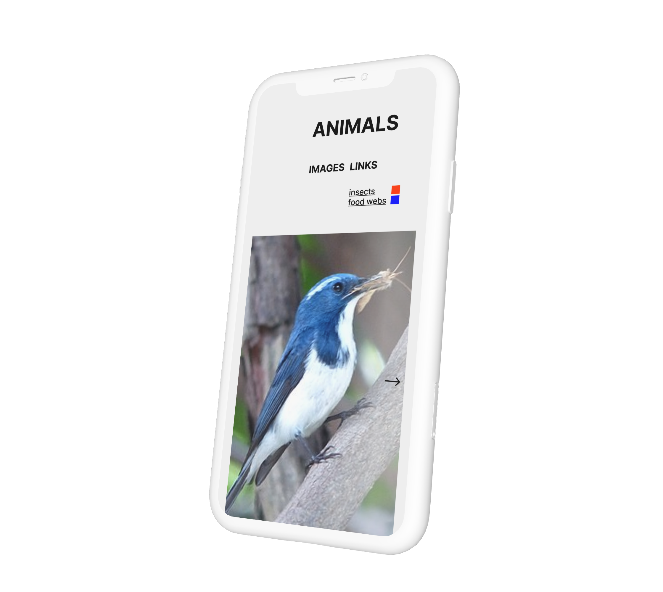
I had the opportunity to explain my design process to Andreas, and he provided a lot of encouragement, noting the value of repeating small steps. He also emphasized considering how the information would be displayed on mobile devices, as people don't only gather information through web displays but also extensively use mobile devices. This insight prompted him to suggest exploring another version of the design.

Reflecting on my target audience, young readers, who spend more time on mobile devices than computers, I strongly felt the need for a mobile version. So, what's the next step? Naturally, it's time to create sketches!

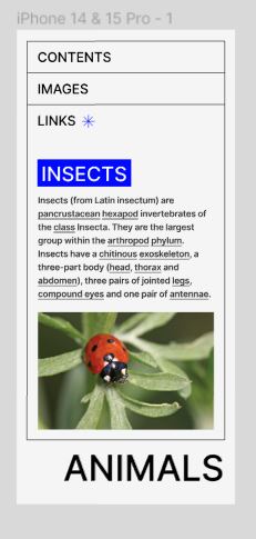
mobile prototype

While on a display, I had the flexibility to incorporate various design elements and make effective use of negative space, designing for mobile devices proved challenging due to constraints. The screen size and aspect ratio limitations made it difficult to maintain the intended design.

Feedback and Reflection

Andreas provided valuable insights into my design process, emphasizing the distinction between physical work and the so-called "wow point." While my peers were engaged in different design areas, focusing on digital work and layout design, I initially felt a vague sense of unease. However, Andreas pointed out that my focus on website design was in a unique field compared to what others were pursuing, boosting my confidence for the upcoming tasks.

Reflecting on the habit of comparing myself to others, I gained a mindset of trusting my abilities and progressing with small steps, believing that this approach would eventually lead to achieving my goals. After these realizations, Andreas suggested shifting the focus from experiments to prototypes. This guidance helped clarify the next steps in my design process, as I had initially considered the three design layouts as prototypes..
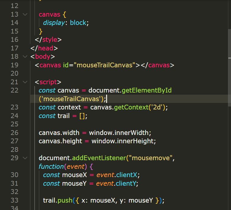
Experiments using cursor.

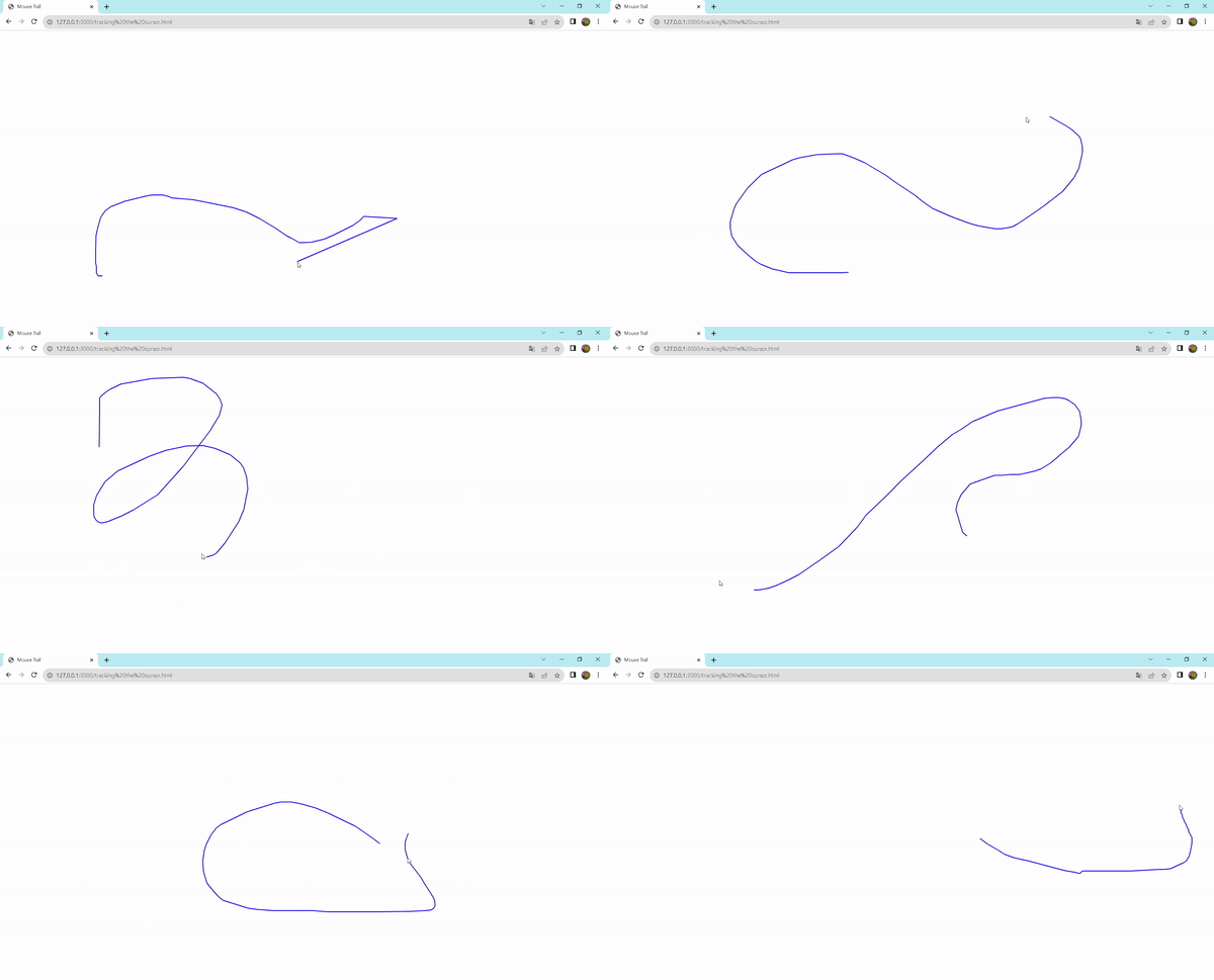
The cursor is also a crucial element in the composition of design. Typically appearing as an arrow, the cursor changes its appearance when hovering over specific elements such as hyperlinks or images, providing users with additional information. When thinking about the cursor, the immediate association is that it marks the endpoint of users' gaze.

Inspired by this, I wondered if drawing lines, like illustrations, wherever the cursor passes could create a new way for users to track their gaze. Without hesitation, I delved into the coding process to explore this concept.

Feedback and Reflection

While my initial goal for this experiment was to implement functionality without adding any elements to the background, what I realized through this experiment was that the generated lines had a significant impact in directing attention. The contrasting blue color against the background, especially, prompted focus on the elongating and shortening shapes of the lines based on cursor movement. Therefore, I came to the conclusion that animations can be another element, along with text size and color, that captures the user's attention.