Creative Process Journal, 23-24.

Week 6

Sharing my experiment with friends was an opportunity to gain different perspectives and receive valuable feedback. I wanted to showcase as much as possible to gather diverse insights.

Through this experiment, I had the chance to articulate what I aimed to achieve and describe the outcomes using hyperlinks. Simultaneously, as I examined my friends' works, I noted interesting aspects and areas for improvement. Listening to their explanations allowed me to learn various approaches they employed, providing insights that enriched my reflection on how I approached using hyperlinks.
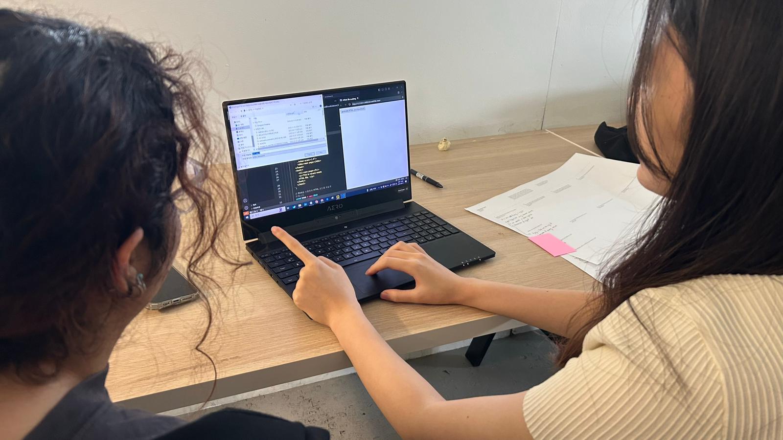
After the class, I discovered the feedback from my peers. The most prevalent comments highlighted the joy associated with the act of clicking itself and the potential for greater interest if I were to leverage hyperlinks to allow for a more diverse range of user experiments. This post-class reflection provided a valuable moment to clearly identify improvement areas for my experiment that I had vaguely sensed before. I believe it was immensely helpful in guiding my efforts towards enhancement.
Research for clicking experiments

As an extension of last week's exploration, I conducted research on several design examples to devise visually captivating methods solely through clicking.

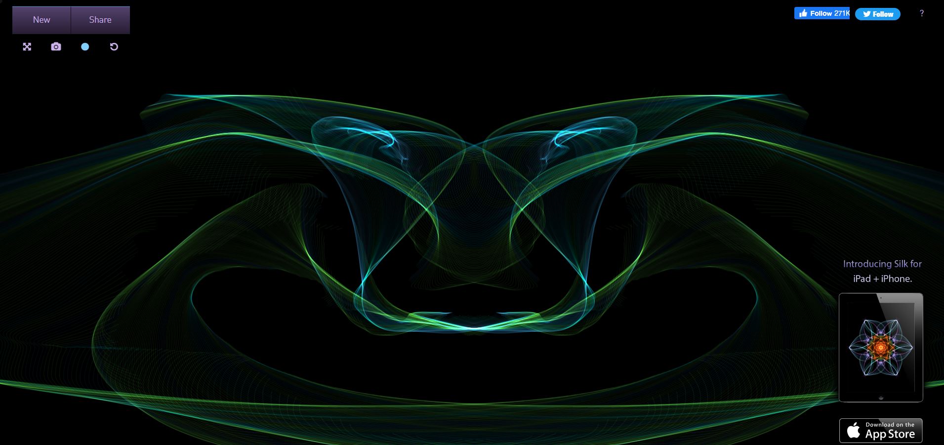
Silk is a website where users can create beautiful drawings and change colors on the screen using their mouse. The artworks created by each user vary based on the time spent clicking and dragging, and the design of the site features a black background to allow users to fully focus on the outcomes they generate. While observing this site, I began considering the additional input actions of 'dragging' and 'click duration.' What if, instead of clicking, users were required to drag to enter a hyperlink? What points of divergence might arise from this alternative input method?

"Patatap" is a web application that combines music and color through simple keyboard typing, creating a visually engaging experience. Various sounds and visuals react to each keystroke, offering users a creative and enjoyable experience. The notable features I discovered in this application are its utilization of keystrokes as input and the incorporation of both visual and auditory effects. The remarkably simple and quick animations enhance the sense of beats. Additionally, the position and range of animations vary significantly for each key input. Some keys move the background color, while others generate short lines.

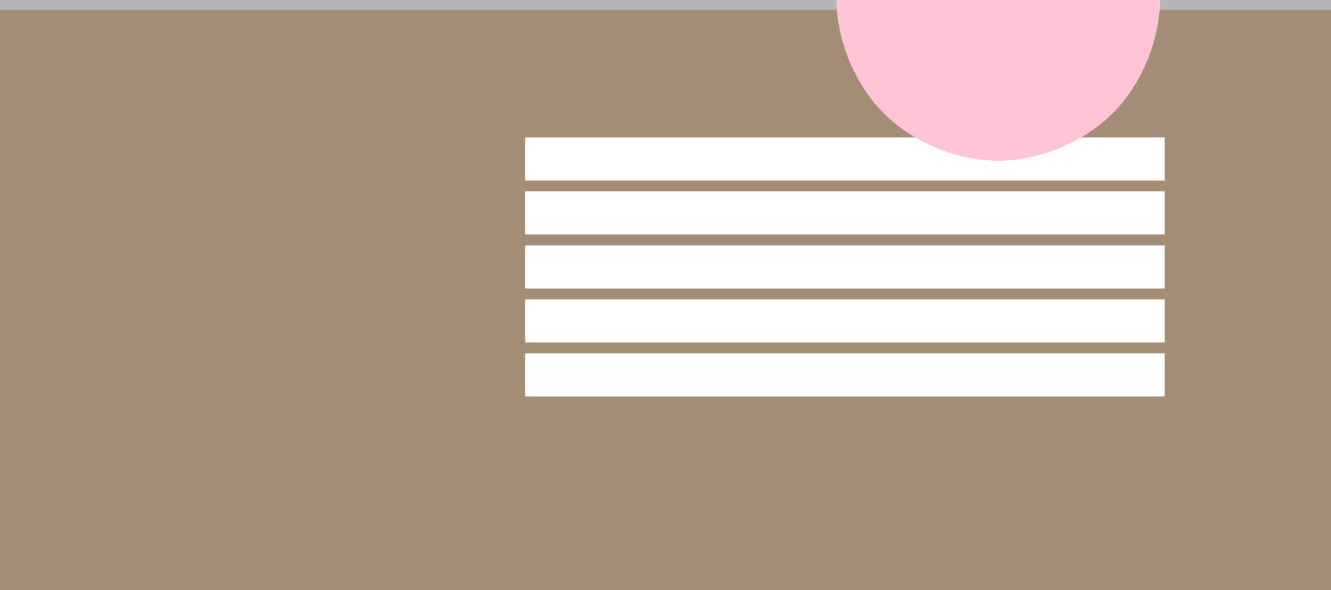
This website prompted contemplation on design elements that capture user interest. Through this, I derived several ideas, such as questioning whether buttons that serve as hyperlinks must necessarily be rectangular boxes and exploring the concept of the background itself becoming a hyperlink.

Feedback and Reflection

This activity showcased examples of engaging users through interactive experiences, making me realize how the conceptualization of visual design varies significantly depending on its purpose. It also sparked thoughts about the possibilities of not only visual but also auditory effects. While I initially believed my ideas focused more on visual design than the concept of hyperlinks, reflecting on the results of my experiments so far made me recognize that experiments without any design constraints limit the diverse experiences users can have.

Therefore, visual design is crucial, and inspired by the ideas generated through today's research, I am eager to embark on another experiment, exploring new possibilities and incorporating both visual and auditory elements to enhance user engagement.