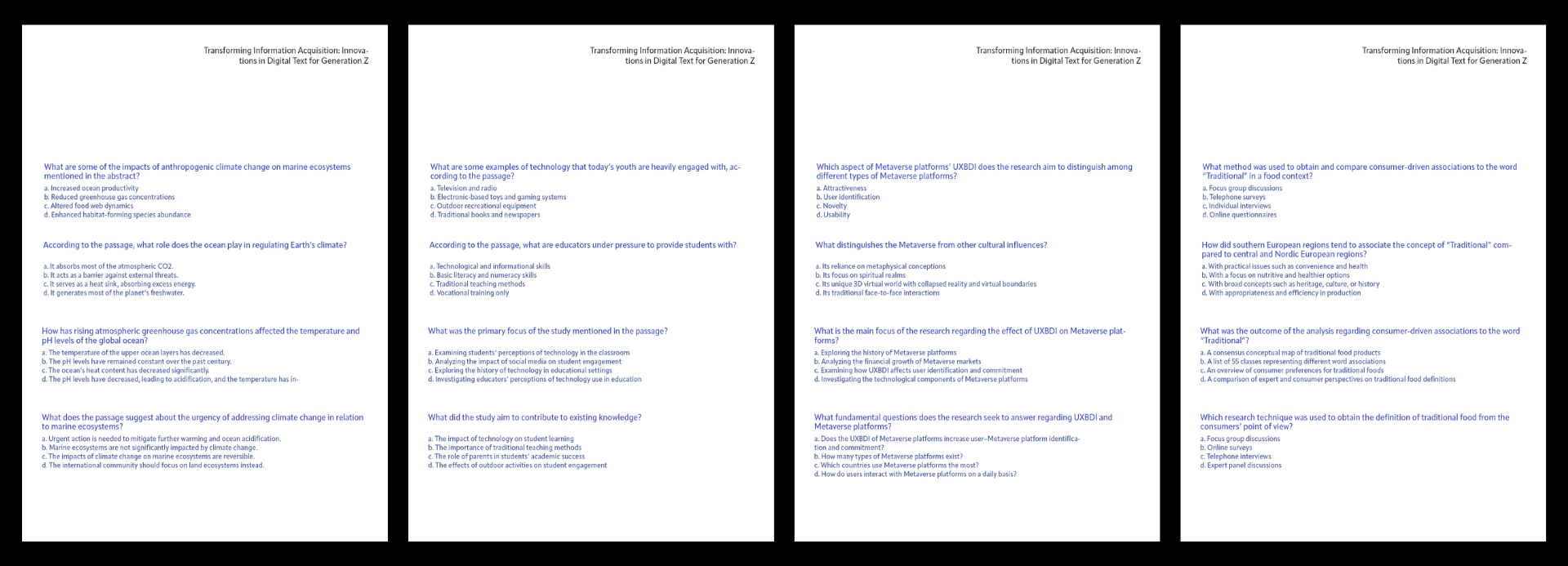
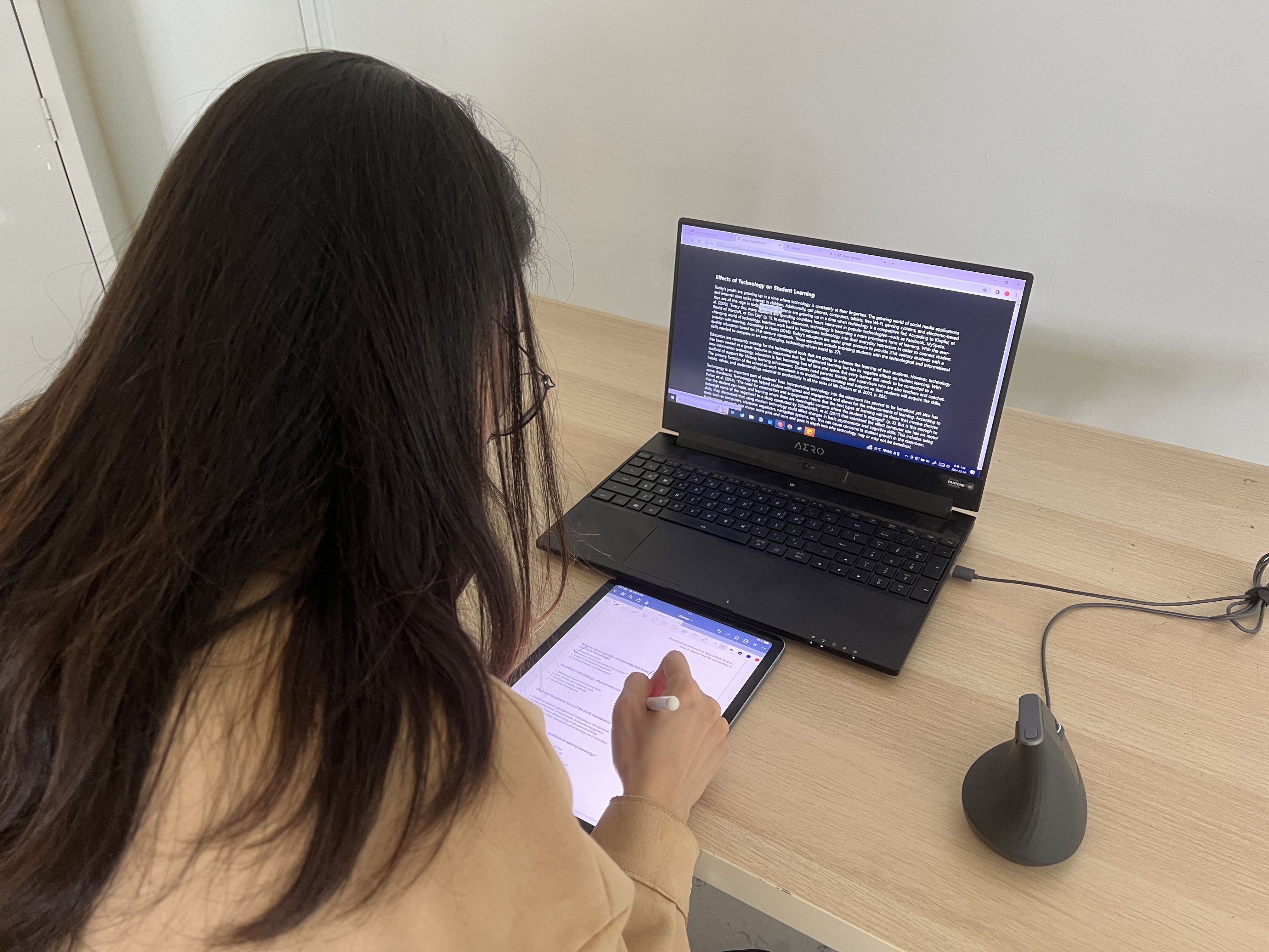
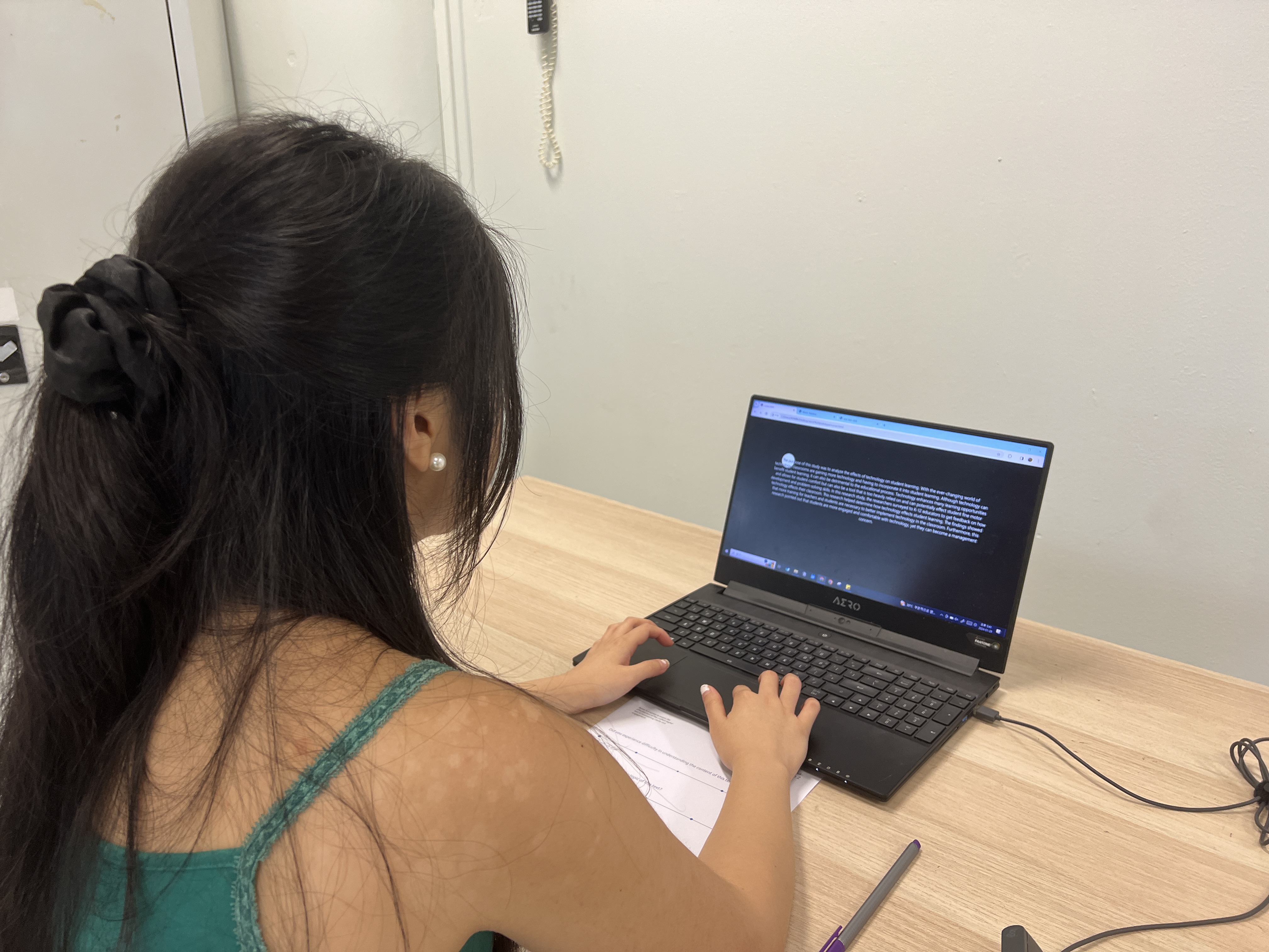
To finalize the design improvements for inclusion in my dissertation, user testing was imperative. Through earlier tests, I recognized the possibility that the method I was using to gauge readability might not be precise enough.
Consequently, I explored alternative user testing methodologies to ensure clearer information delivery. I decided that having users read parts of academic papers with interactive elements, and then answer questions to ascertain their understanding, would be the most direct approach.
For each web page, the number of correct answers to questions about the displayed text would indicate the clarity of information conveyed. A higher average score per web page suggested that the web page was effective in delivering information and maintaining users' concentration.
I extracted excerpts from various academic papers, standardized the text length to around 600 characters, and inserted these into each interactive page. There were five questions related to each paper, and users proceeded to answer these questions after reading the content on the website.


The results from this survey were as follows:
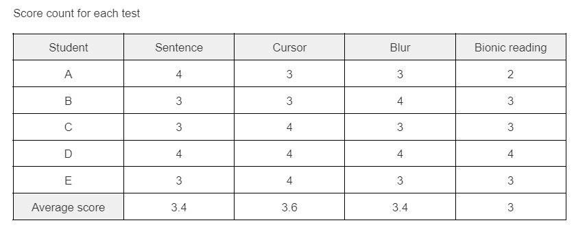
Unexpectedly, the Cursor highlight experiment scored highest, followed by sentence highlight, then Blur, with the bionic reading experiment receiving the lowest score at 3.0. This outcome prompted me to consider the distinctive aspects of the cursor experiment that made it so effective in transmitting information and retaining concentration. The key difference was the highlighting effect created by color inversion. This led me to reflect on the attention-retention power of inverted colors.
The surprising performance of the Cursor highlight experiment suggests that the visual contrast provided by the color inversion might be significantly helpful in maintaining the reader's focus. This aligns with known principles in visual design, where contrast is used to attract and guide the viewer's eye, thereby enhancing the user experience and making the content more memorable.
These insights have valuable implications for the design of interactive reading interfaces. They suggest that visual design elements, such as color contrast, can be as important as the content itself in holding the user's attention and improving comprehension. Moving forward, these principles can be applied to further refine the design, ensuring the final product is not only visually appealing but also functionally superior.
Understanding the impact of the Cursor highlight leads to a broader consideration of how design can influence user interaction and engagement. Beyond the dissertation, these findings can contribute to the field of user experience (UX) design, where the goal is to create interfaces that are not only intuitive but also maximize user retention and comprehension.
In conclusion, this phase of user testing has been invaluable. It provided a data-driven foundation for making informed design choices and highlighted the importance of user-centered design in creating effective digital tools. The insights gained from this process will significantly enhance my dissertation's quality and contribute to my development as a designer.