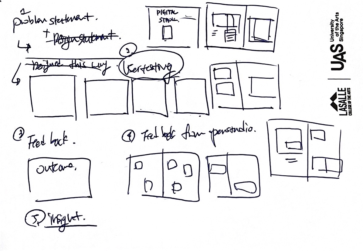
After reviewing video references that could adequately present these three elements, I sketched each scene.

Based on the deliverables recommended by Andreas, I curated what I believed would effectively communicate my work upon final presentation. The finalized deliverables, focused on explaining the design layout and the functionalities of my created website, were as follows:
The key points to showcase in the layout design were:
1. The choice of a black and white color scheme and the rationale behind it. 2. The relatively clean layout and the reasons for this design choice. 3. Prototypes demonstrating how the design would materialize on both web and mobile platforms
After reviewing video references that could adequately present these three elements, I sketched each scene.

The produced video looked like this:
By adding to the video created for the Open Studio, interactions of each website could be more clearly explained. Therefore, after quickly completing the sketches, I used After Effects to introduce the features of each page, accompanied visually with text that expressed the content interaction.
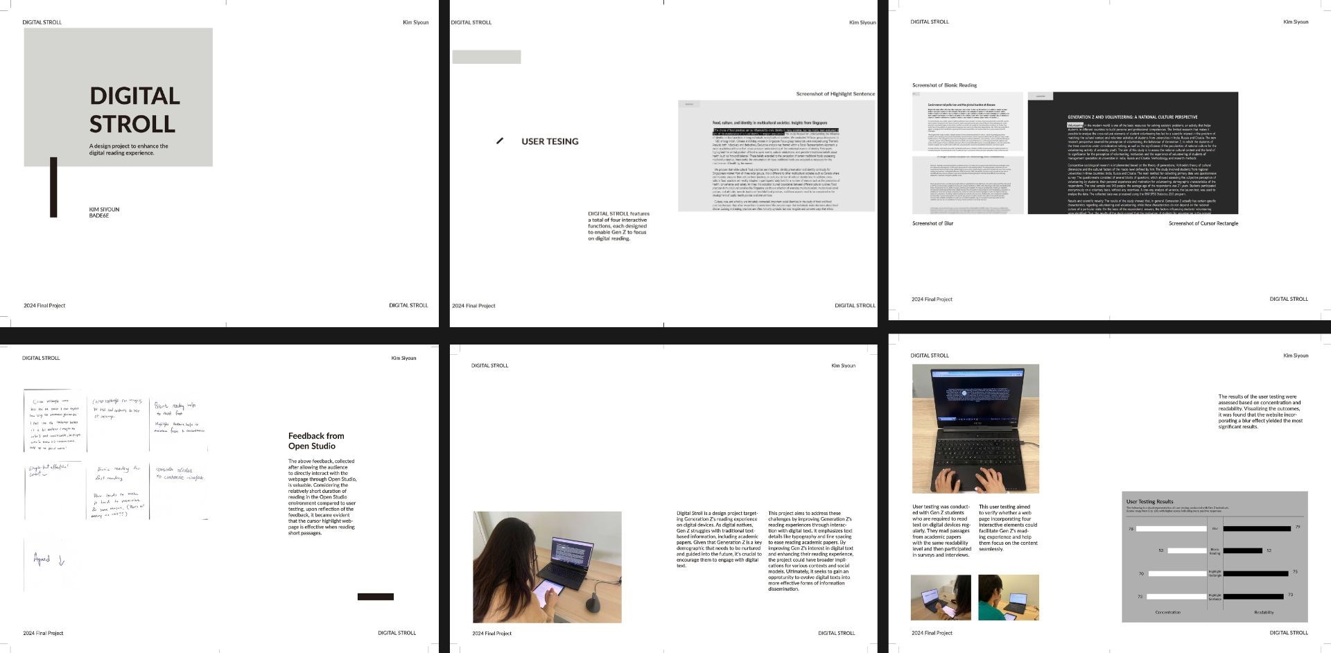
The booklet design, meant to clearly articulate my design statement and showcase the final user testing, had to possess a very clean and minimal layout design.
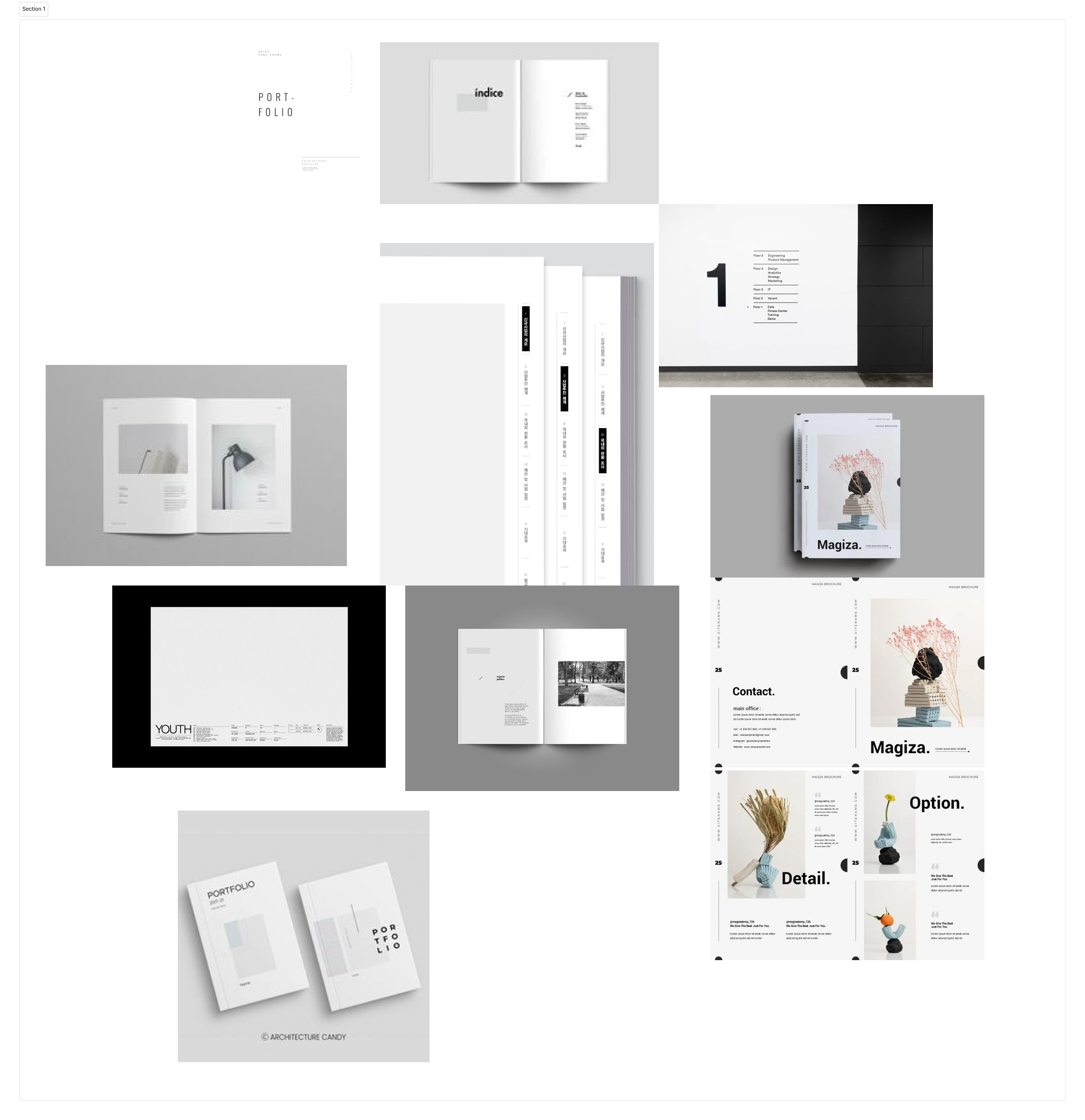
For a neat layout, I continuously gathered references to create a mood board.

The final product of this process was as follows:

This semester has been a journey of diverse experiences, prompting deep reflection on my design practice. The constant user testing to optimize the design for the audience was particularly insightful, proving that there is no end to development with each testing providing new reflections and experiences. Additionally, I felt the tangible reality that completing a single piece of work entails various stages and takes a considerable amount of time. Although this project marks my last design at Rachel, the experience has allowed me to grow as a designer, enhancing my coding skills and fostering diverse growth.