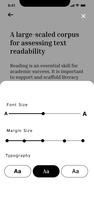
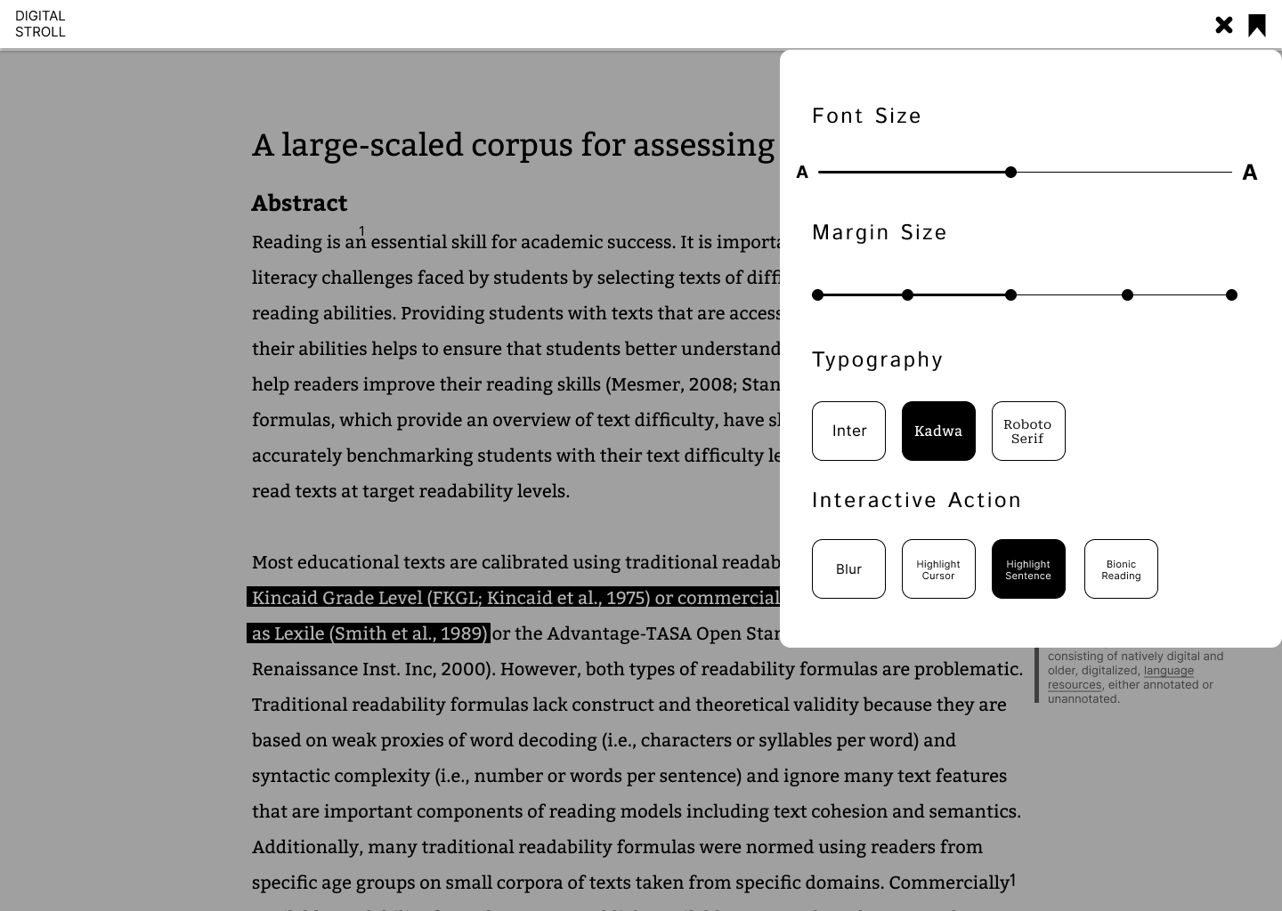
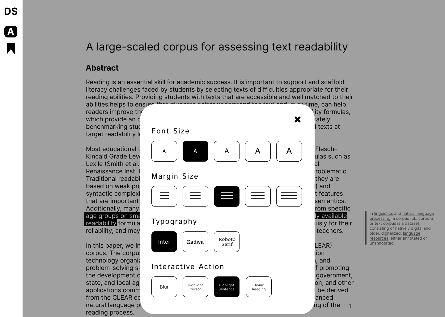
After the Open Studio event, I had the opportunity to share the work process and content in front of my peers. This valuable time allowed me to receive new feedback, with the most prominent comments focusing on the layout design. Although the designs were mostly unified, it was evident that the newly created customizing options, along with the UI/UX design, required substantial revisions. An additional point raised was the need to improve the cursor highlight experiment by addressing the discomfort in cursor movement.
To accommodate this feedback, I began work on two new website layout designs and one mobile version layout design, all in monochrome. The reason for this color choice was my concern that the presence of accent colors might distract users from the text to the colors. For the same reason, and because the focus should be on the text, all designs were created with a minimalist approach.


To address the discomfort with cursor movement, I experimented with several solutions. The main issue was that highlighting each word with the cursor required more concentration than anticipated, potentially disrupting the user's focus on the text. One solution discussed with Andreas was to fix the cursor's vertical axis when hovering over a sentence, allowing the cursor to move along with the sentence.
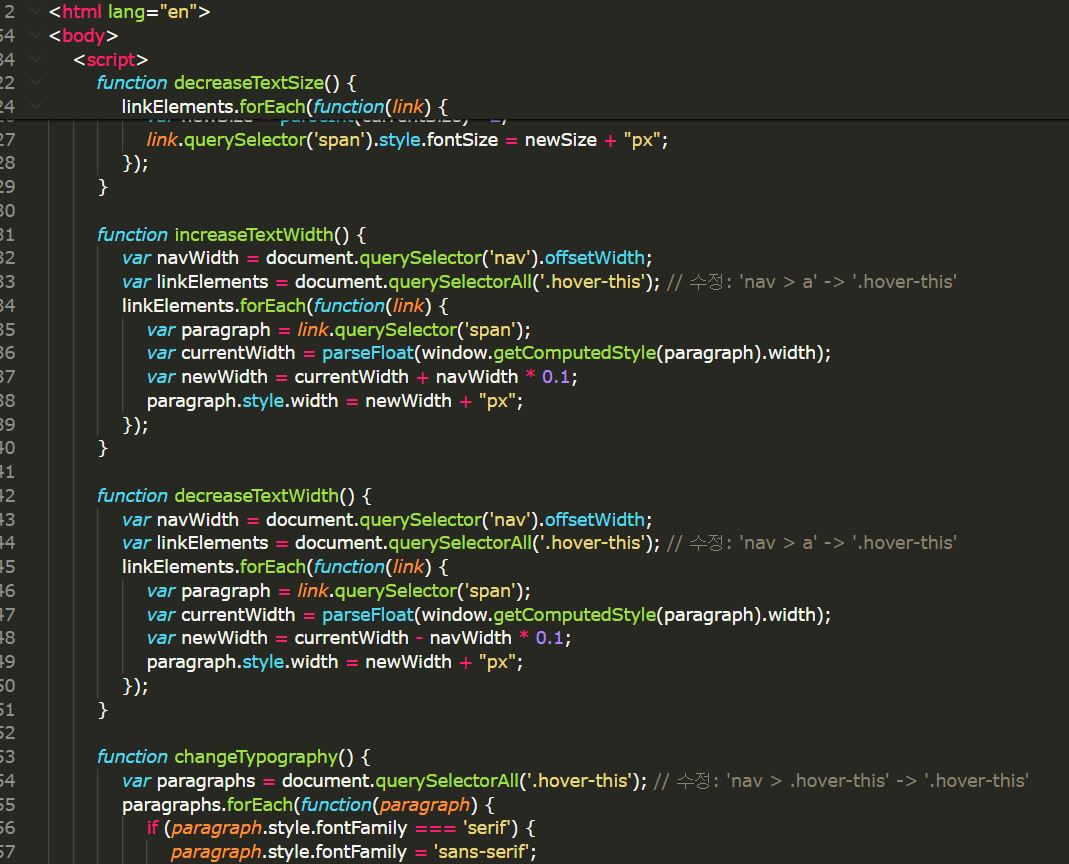
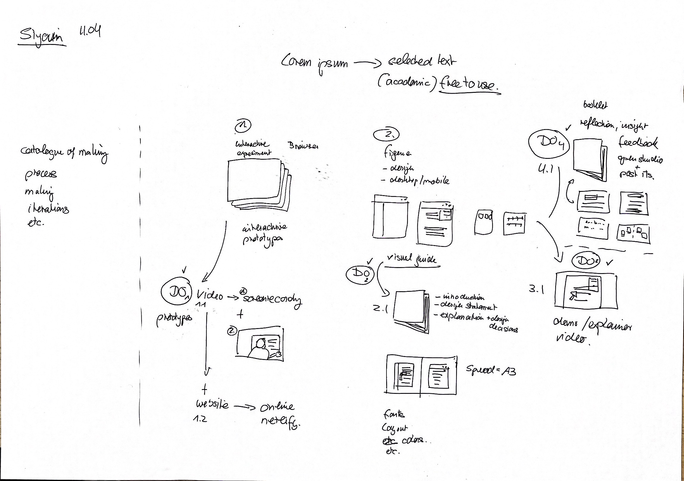
Just like when I was implementing the customization options, this process took longer than expected. During a personal feedback session, I shared my current situation with Andreas and asked for his advice on the technical issues. Andreas suggested that at this stage, the priority should not be coding but rather presenting a successful final product, and provided me with a list of recommended deliverables. With only two weeks left, I agreed that following his advice was best and immediately began planning to produce the recommended deliverables within the deadline.
Time management is crucial in the design process. Throughout the creation of this project, I had to balance between a successful time allocation plan and focusing my efforts on the elements I wanted to prioritize. Although I realized my missteps in time distribution towards the end of the semester, this realization once again highlighted the importance of planning as a designer.