Creative Process Journal, 23-24.

Week 4

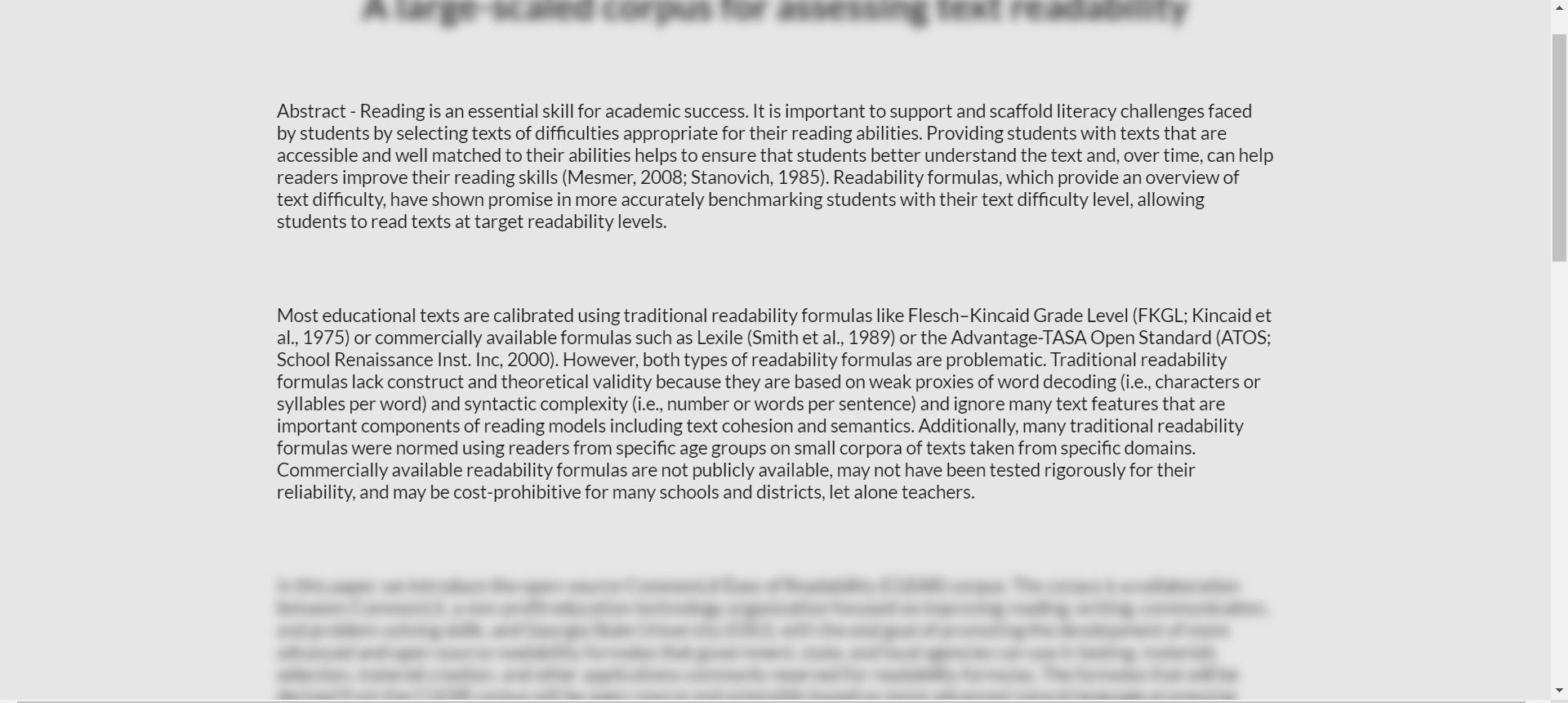
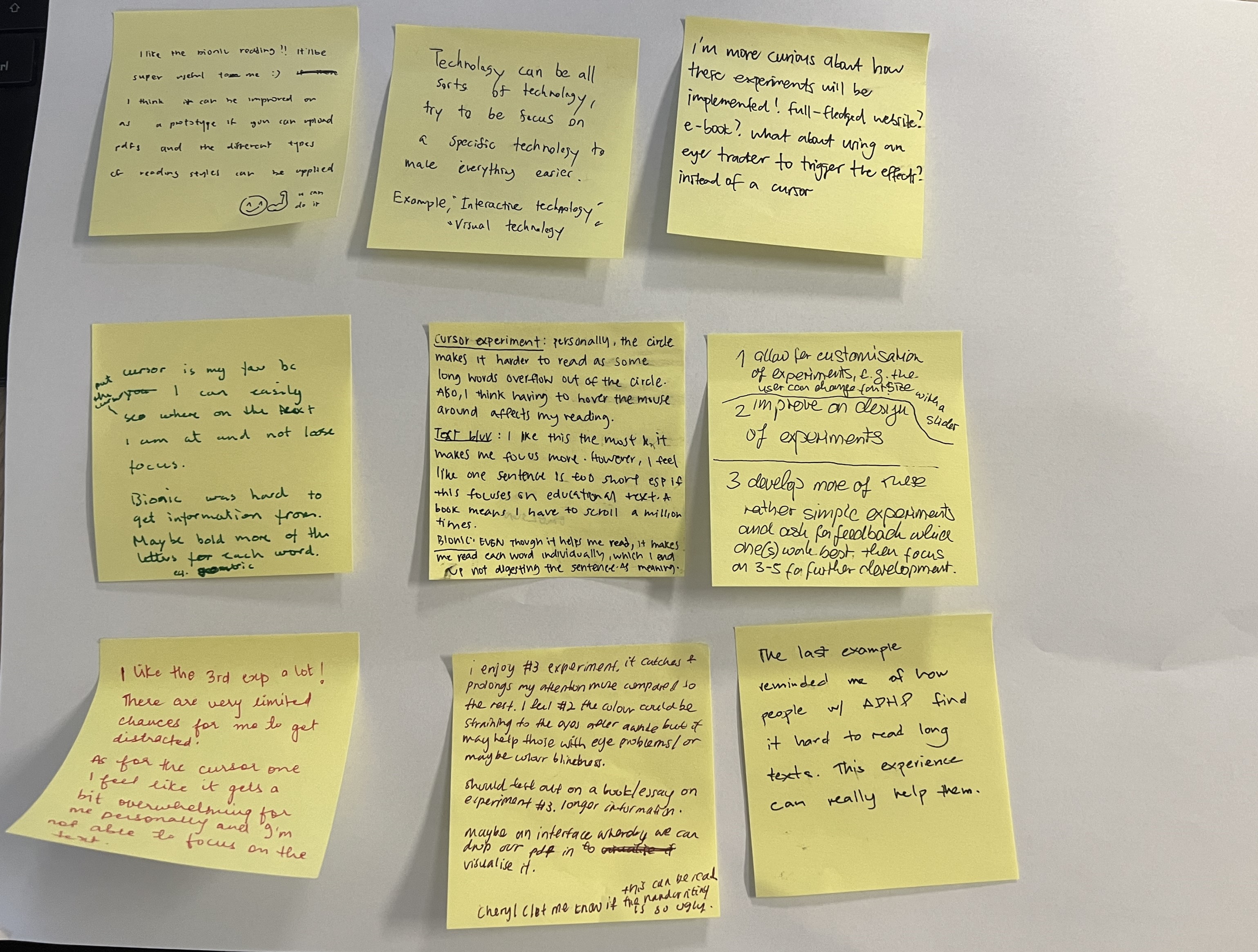
Following the user testing, Andreas highlighted the importance of not just functionality but also the finer visual elements of web page design. This prompted a realization that I had been overly focused on coding and feature implementation. As a result, I revisited the process of sharing my current status with peers, just as I had done in the first week, and solicited design-centric feedback. Surprisingly, I received a wide range of opinions and assistance that I had not anticipated.

One piece of feedback that stood out and required prompt attention was the need for a unified layout. Since the user testing was based on the usability of interactive elements, it became clear that visual elements like design needed to be consistent. This was a point raised not by one but by all of my peers, prompting me to start collecting decisions related to design accordingly.
During my research, I identified several layout and design principles that could enhance readability. Some elements that I considered applicable to my website design included:

The general feedback collected for each web page included:

Overall, a unified font choice was deemed necessary.

Taking these feedback points into consideration, the resulting design changes were as follows:

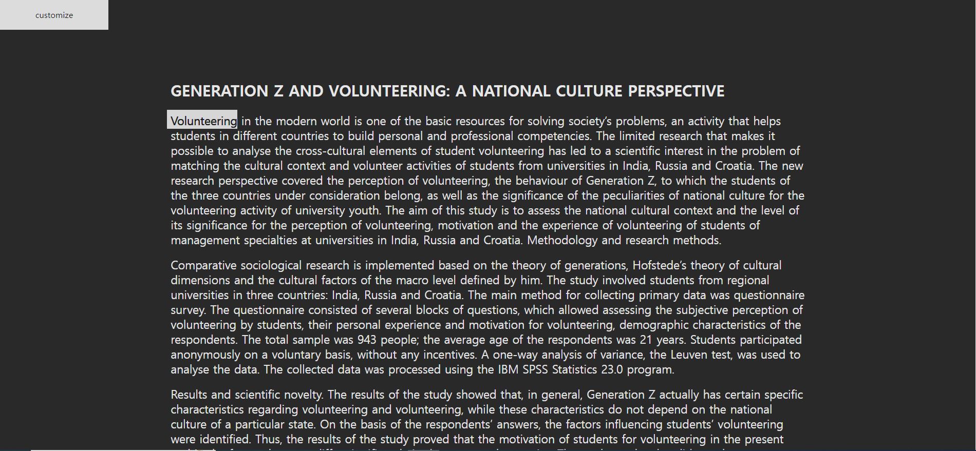
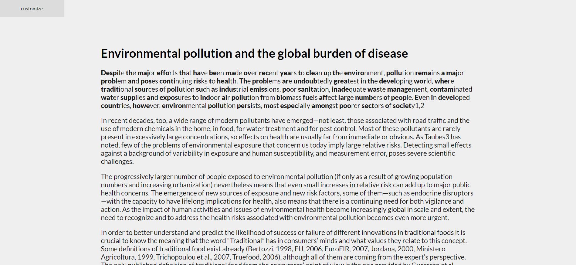
For the bionic reading and most text backgrounds, I standardized the color to gray, and the font size and line spacing were unified according to design principles. In the blur experiment, I reduced scrolling by applying blur at the paragraph level instead of sentence level.

Observing participants using the cursor experiment, I gleaned that people read words faster than expected during user testing. This observation led me to question whether highlighting at the sentence level rather than the word level might be more effective. A cursor highlighting words must move as quickly as the reading speed, which could potentially cause discomfort due to the constant need to move the mouse.

Therefore, I created a 'highlight sentence' website where the cursor highlights text at the sentence level when hovered over. The outcome is demonstrated in the video below.

Feedback and Reflection

This week, receiving design feedback from my peers taught me the importance of listening to diverse opinions and integrating them into my work as a student. I also realized that while it is vital to evolve design ideas through quantifiable results, observing how users interact with the website is equally important. From this standpoint, I discovered new methods of user testing.