Following Andreas's feedback, I made some modifications to CPJ by introducing variations in layout design and adding accent colors to certain points.
.jpg)
.jpg)
.jpg)
Following Andreas's feedback, I made some modifications to CPJ by introducing variations in layout design and adding accent colors to certain points.
.jpg)
.jpg)
.jpg)
The first thing to tackle is defining the problem statement. Acknowledging that there is a desired outcome but it's not clear, and realizing the lack of a clear direction so far, I used a diagram to organize my thoughts, starting from a starting point.
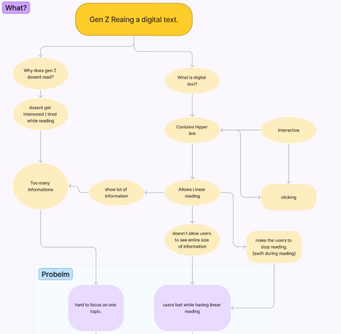
Through this process, the derived problem statement is as follows:
“Young readers lost while having linear reading process”
The problem statement emphasizes designing digital text with hyperlinks to encourage users to make choices and actively acquire information. Drawing inspiration from an article, I considered how individuals using digital text acquire information.
Young readers typically go through a process of roughly reading the text and then acquiring information by combining and reinterpreting their own experiences and knowledge. Focusing on the aspect of 'combining and reinterpreting' information, I explored features that could make it easier for them to collect information.
Given the common practice of summarizing key points in notes to aid memory, I pondered the idea of easing the cognitive load on users' memory. Specifically, when users click on words in the content, the text inside a note box could update. This feature aims to facilitate information retrieval for users by updating the content in a note box as they click on words in the digital text.
After realizing the importance of website design, I started by creating a mood board for the web design.
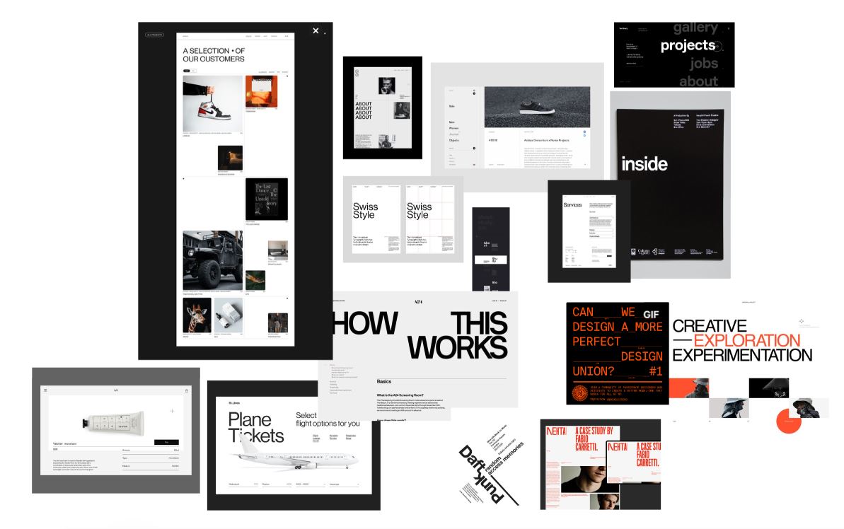
From a design layout perspective, I determined that a simple yet elegant Swiss design, utilizing negative space, would be suitable. I believe a clean design that doesn't compromise readability when users read text is essential. Hence, I focused on this keyword to shape the mood board. Throughout this process, I predominantly used black and white colors, minimizing the color palette to diversify the text layout design.
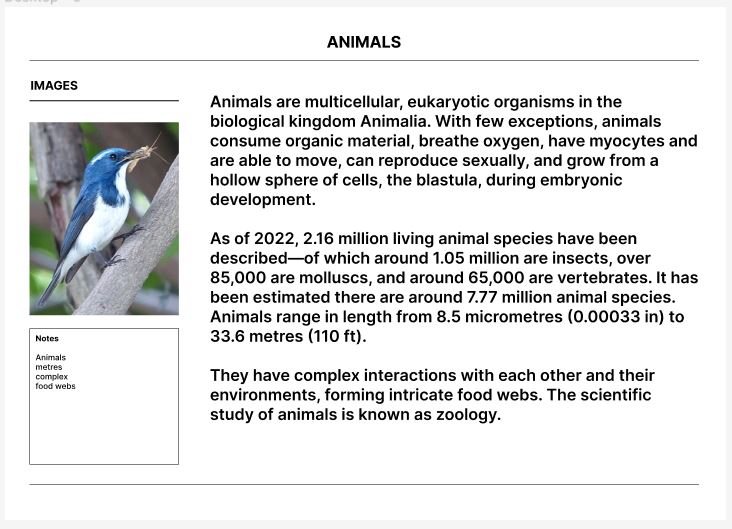
Taking these design characteristics into account, the resulting web design layout looks like this.
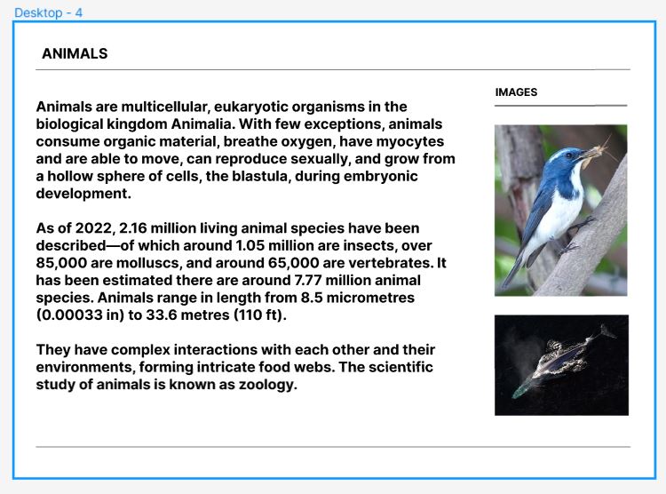
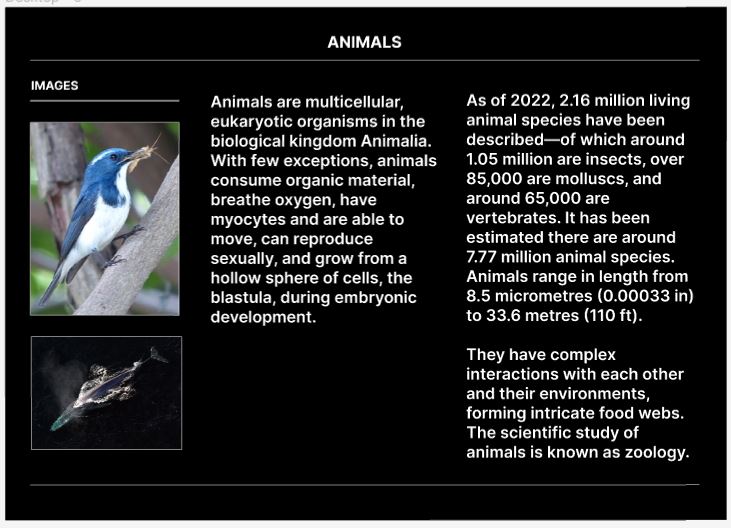
In my daily life, I've discovered various design elements hidden in plain sight and gained experiences in recognizing and utilizing these designs. I've come to realize the importance of clear problem definition. While it might seem a bit late to grasp this concept in Week 10, I understand the significance of planning once again. Finally embracing Andreas's constant advice of "just do it" made me feel like I've truly put it into practice. While contemplation is essential for a designer, acknowledging when the pondering becomes too prolonged is crucial. I've learned that prolonged contemplation can hinder progress and keep you circling around the same problem. Thanks to Andreas, I've become aware of my current situation and realized the importance of regularly assessing my progress in this ongoing journey.