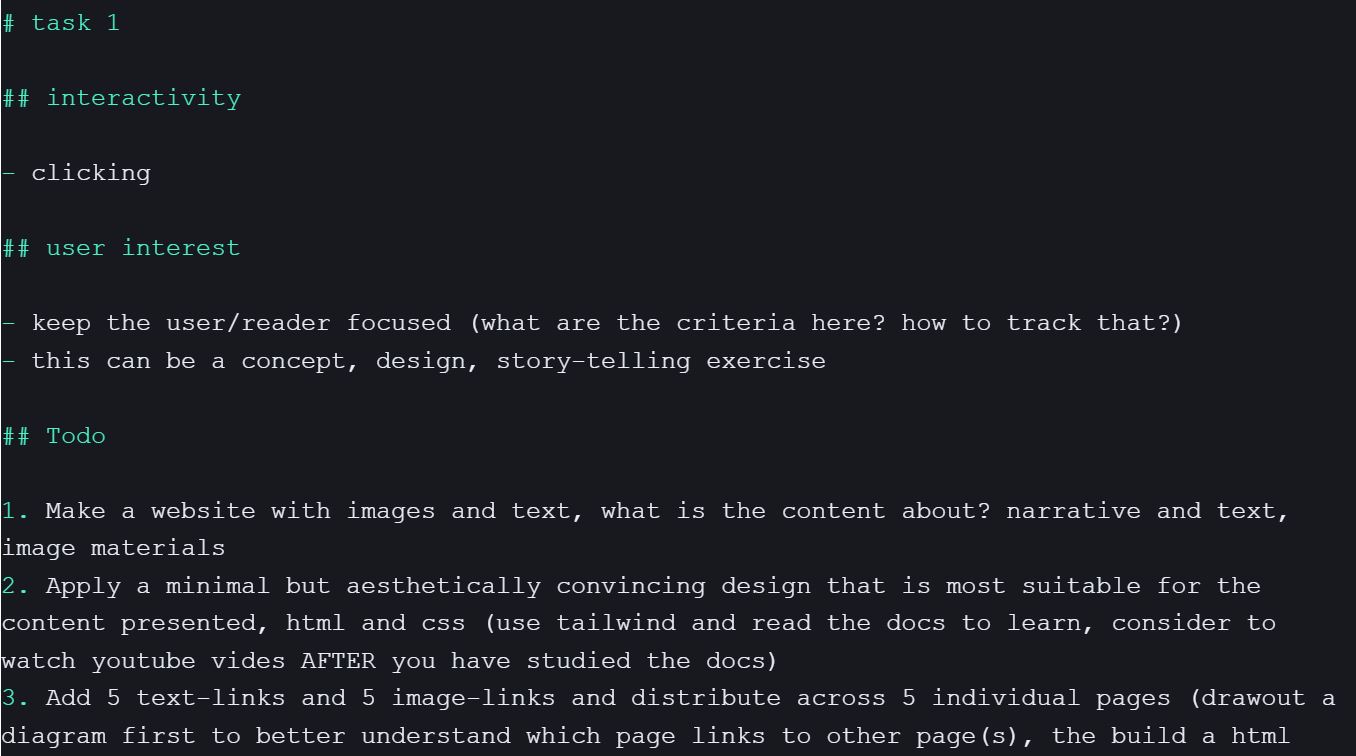
During Project Week, I was fortunate to receive feedback from Andreas in various aspects. Even though I didn't believe I was producing satisfactory results or on the right track, his feedback was immensely helpful because it clearly identified areas for improvement.
Catalogue of Making: The Catalogue of Making is deemed unfinished and lacking in visual language and design direction. I was encouraged to develop a clear design approach, combining technical, conceptual, and visual elements for stronger and more convincing experiments.
Practical Work Aesthetics: The need to enhance the visual language and aesthetics of practical work is emphasised. Studying references, design literature, and the work of other designers is recommended for iterative improvement.
Documentation and Journaling: The need for consistent and comprehensive documentation in the Creative Process Journal (CPJ) was required. Daily note-taking, visual elements, and regular updates to the website design are suggested to better reflect the designer's personality and work.
The organized feedback revealed more areas for improvement than I had initially thought. Particularly, receiving feedback that, as a student studying design, I should pay more attention to aesthetics, sparked various and complex thoughts. The most significant takeaway was the motivation to plan and execute future tasks quickly. As Andreas continually emphasized, merely thinking about things was akin to staying in one place. Therefore, I made a list of tasks, prioritized them, and began working on tasks that I could immediately accomplish.
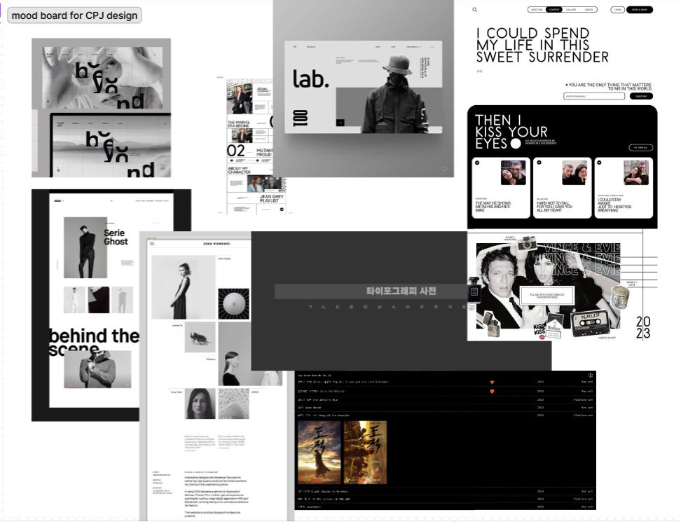
In creating the mood board, I considered the following design points:
1. Is the design clean and minimal enough to emphasize the functionality of hyperlinks?
2. Does the design avoid awkwardness when placing photos?
3. Is the layout diverse and not monotonous?
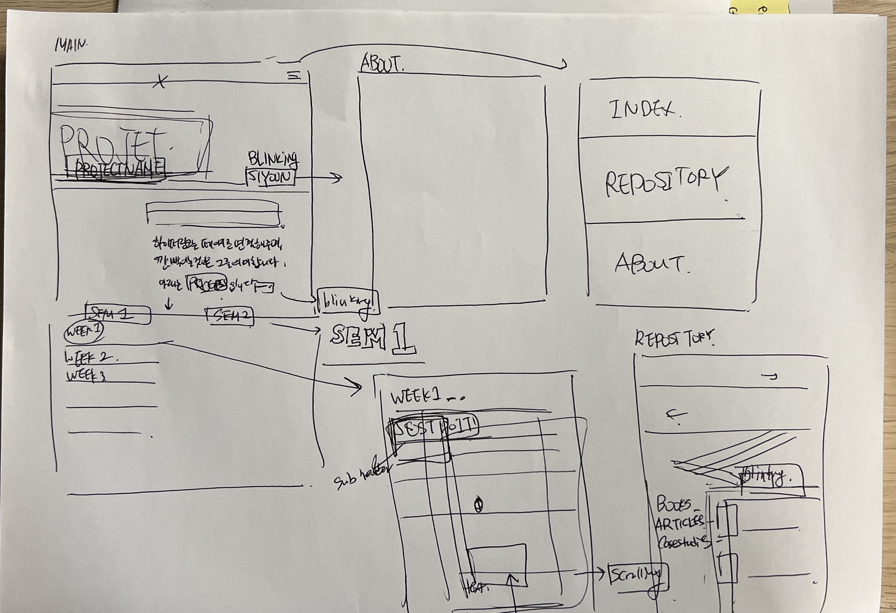
Referring to the mood board, I sketched layout designs utilizing black and white as the primary colors, incorporating negative space. I wanted to ensure the designs highlighted the functionality of hyperlinks while maintaining a clean and minimal aesthetic. As the initial layout sketches in a simple format might not fully convey the overall feel, I decided to move on to the next step: digitally implementing my sketches.
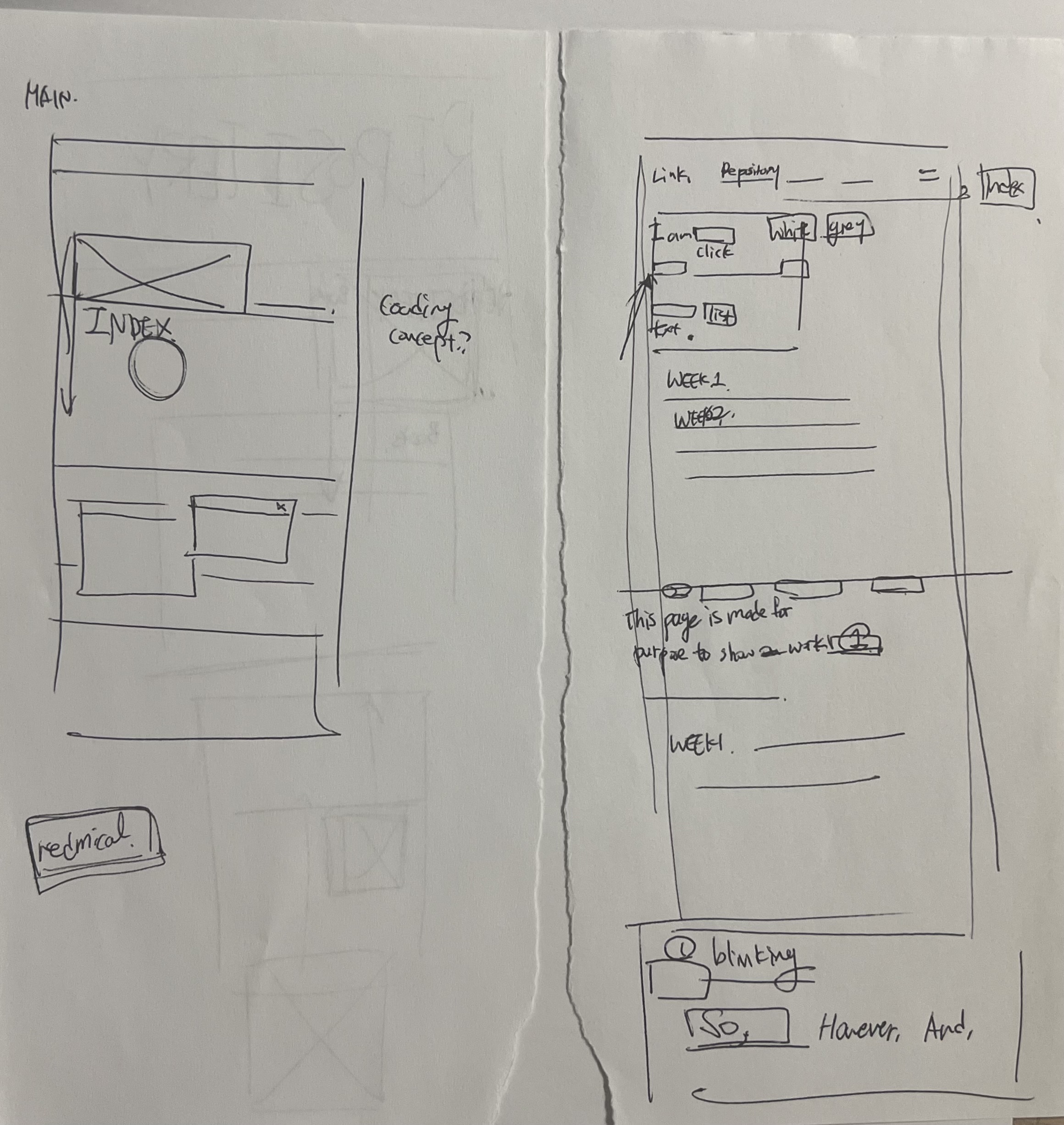
While sketching, I came up with the idea that, given the emphasis on hyperlinks as the theme, it would be beneficial to incorporate various hyperlink texts to explore the content. Building on this idea, I used Illustrator to create a prototype. Since hyperlinks are code-based, I opted for a font that gives a coding-like feel, and when using lines, I chose a dotted line for a distinctive touch instead of a solid line.
One realization I had during the design sketch process is that there is always room for improvement. While the overall design appeared clean and reflected my intentions, Andreas mentioned some dissatisfaction with the font choice. The font design, chosen to align with the concept, posed difficulties in conveying content. Additionally, he noted that a design predominantly in black and white might not convey the intended message effectively when diverse colored photos are added.
This experience taught me not to be complacent with the current design and to continually seek improvement. It also prompted me to adopt a new design mindset: rather than fixating on one perspective, continuously request feedback to enhance the design. The next step is to make some adjustments to the CPJ design based on these insights.
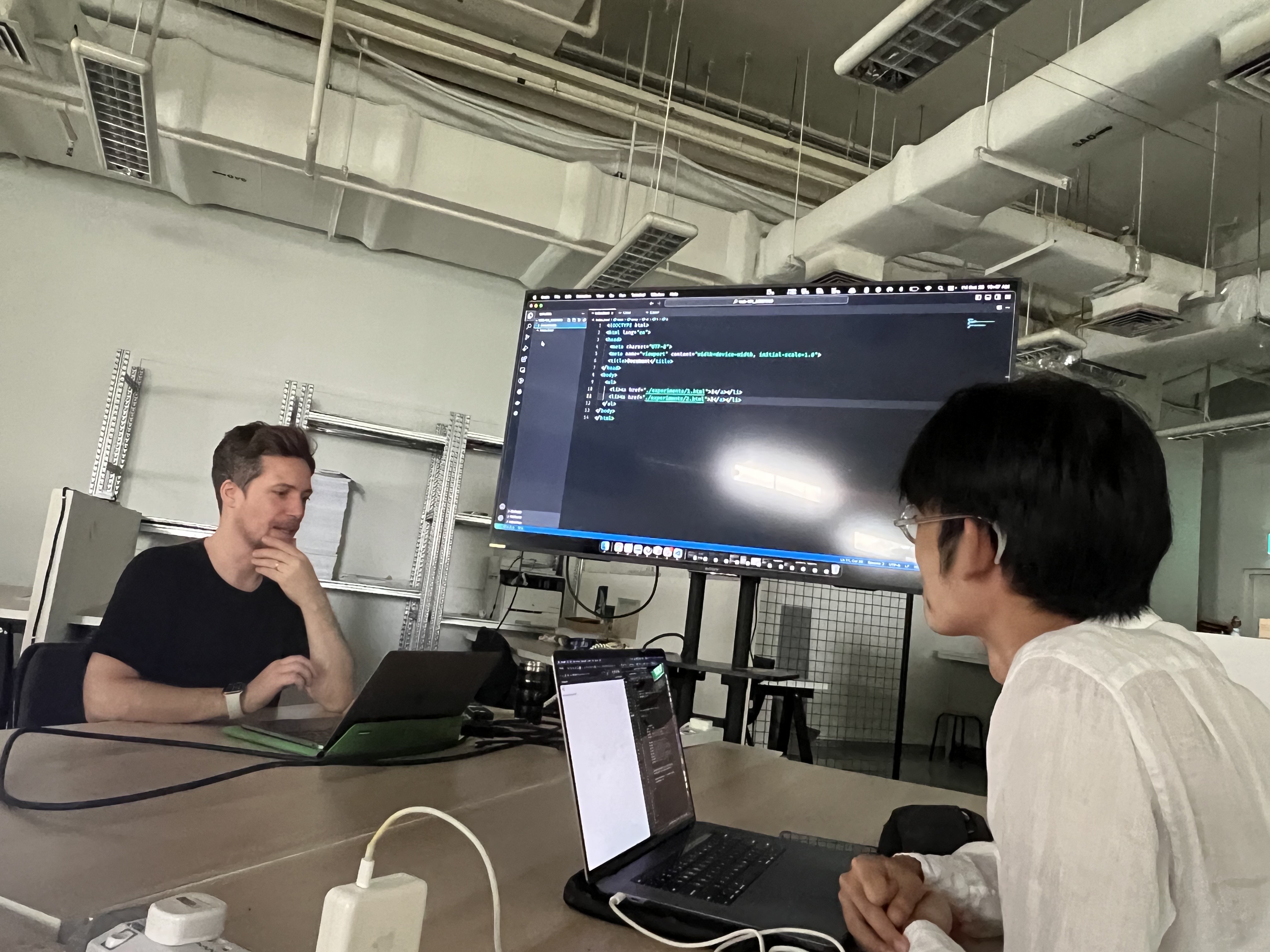
On Friday, I had the opportunity to share our progress with Shalom, who also focuses on hyper text, and engage in a discussion with Andreas about our respective projects. Shalom effectively explained his current work process using visual diagrams, and his prototype showcased diverse progress in various aspects. Through this session, I gleaned several coding tips.
My goal for this session was to seek advice on progressing with prototypes using ideas that involve both auditory and tactile elements. However, I regretfully only described the concepts verbally to Andreas without creating any specific prototypes. I acknowledge the missed opportunity to explain them visually through personal prototypes.
Andreas, noting the importance of focusing on hyperlinks rather than auditory and tactile elements, provided clear insights into my current situation. Through our conversation, I realized that I lacked sufficient information about hyperlinks and hadn't defined a problem statement before rushing into the next steps. Andreas advised against trying to reach the end immediately and encouraged me to achieve small successes step by step starting today. Thanks to his guidance, I could clarify what I need to do next and alleviate some of my impatience.
Communication plays a crucial role in design by conveying both my purpose and process clearly. Since the last session, I've been contemplating various thoughts, and the most significant realization is the need to organize my thoughts clearly when explaining ideas.
Additionally, having a friend who is on the right track with the same topic inspired me to acknowledge my shortcomings as a designer positively. Recognizing that there's someone ahead in the same field allows me to view it as an opportunity to learn and improve. Thanks to this perspective, I gained significant motivation through him and was able to outline plans for the next steps. This experience not only shaped my designer mindset but also taught me a valuable approach to learning when studying.