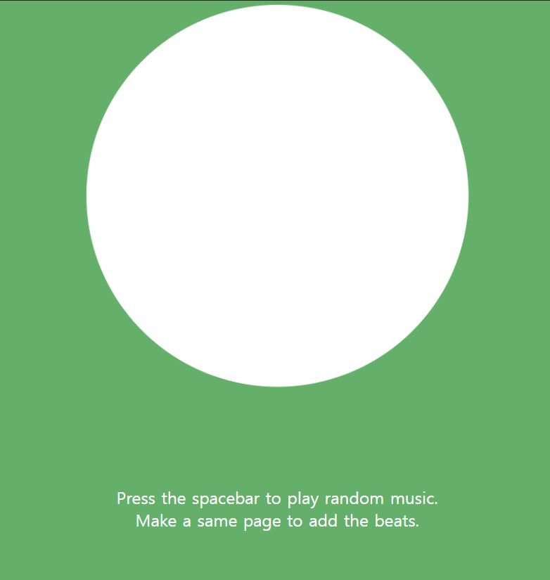
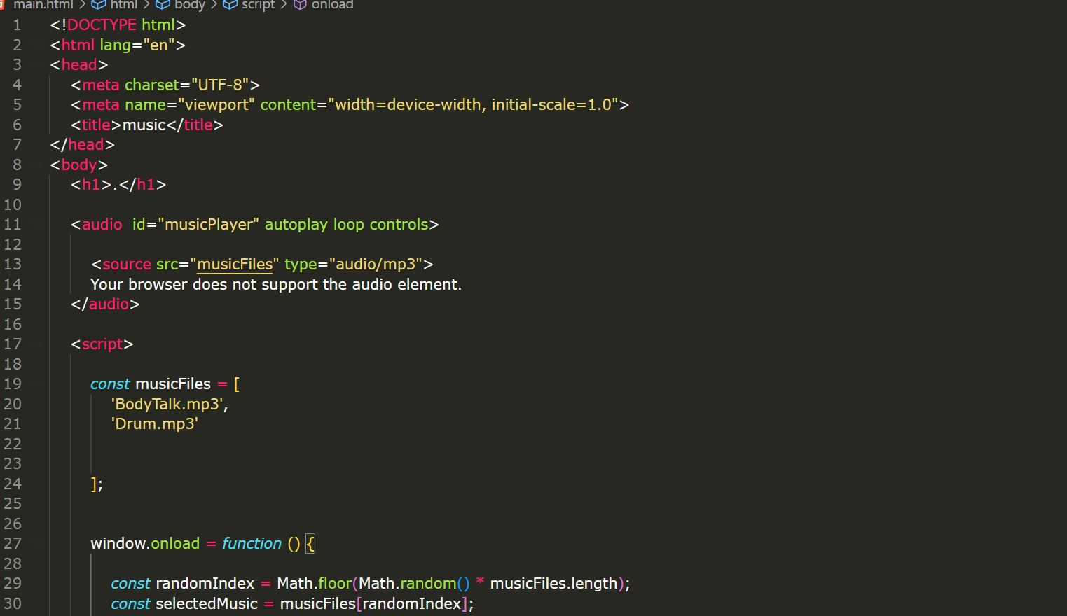
Based on the ideas derived from the research conducted last week, I decided to code two experiments. The concepts that emerged are as follows:
1. Making the websites working with sounds
2. Dragging the hyperlink
It was interesting to find the topic which is based on museums. Because i thought people these days dosent visit the museums as much as before. since the techology advanced, people could get lot of information from internet. also the informations that people could adopted form the museum. To me, using interactive technology to engage children seemed effective, as I had a lot of fun participating in an exhibition that utilized interactive technology (even though I am not a child!). Additionally, the case study he researched was inspiring for me as well, since i also utilize interactive technology.
1. The process of users manually copying and pasting the website's address proved to be cumbersome.
2. The screen appeared monotonous.
3. Users were left without any instructions, making it unclear what the website's functionality was.
To address these challenges, I opted for the simplest solution: incorporating text introductions. Additionally, I filled the monotonous screen by adding some moving visual elements. This not only made the website more engaging but also provided users with clear instructions on its functionality.
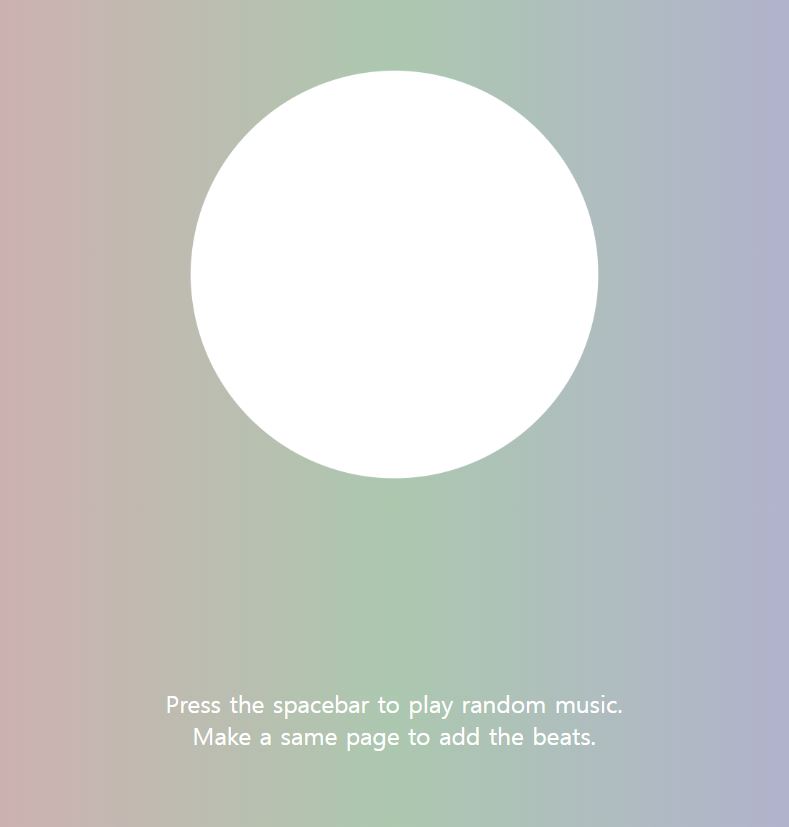
The most challenging aspect was the inability to autoplay the music automatically. Despite various attempts to resolve this through research, all efforts proved unsuccessful. Upon discovering that Chrome prevents autoplay of music through code, I decided to address this in the instructions by intending for users to manually press the spacebar to initiate the music. The resulting product looked like this.
Using hyperlinks, the most common way to interact is by clicking buttons. But what if, instead of clicking, users had to drag? This idea, sparked by a simple question, aims to playfully challenge the traditional use of hyperlinks.
The initial step was to create a page where dragging, not clicking, activates the hyperlink. The outcome looked like this.
One of the payment methods in OCBC includes a payment window where dragging to a specific location, i.e., pushing it all the way, activates the payment. Focusing on the concept of a 'specific location,' I divided the screen in half and created code that requires dragging the text to the left for the link to activate.
Through the experiments, I faced various challenges such as the inconvenience of users having to copy and paste the website address, the monotony of the screen, the absence of user instructions, and the difficulty of implementing automatic music playback. While experiments may start simply without concrete plans, I encountered more diverse obstacles than anticipated. In the process of overcoming these challenges, my problem-solving skills significantly improved. Through these experiences, I realized the importance of finding ways to enhance user experience.